Design Concepts
All of these projects are designs that I have worked on individually or with a group. They are all concepts for either school or personal use.


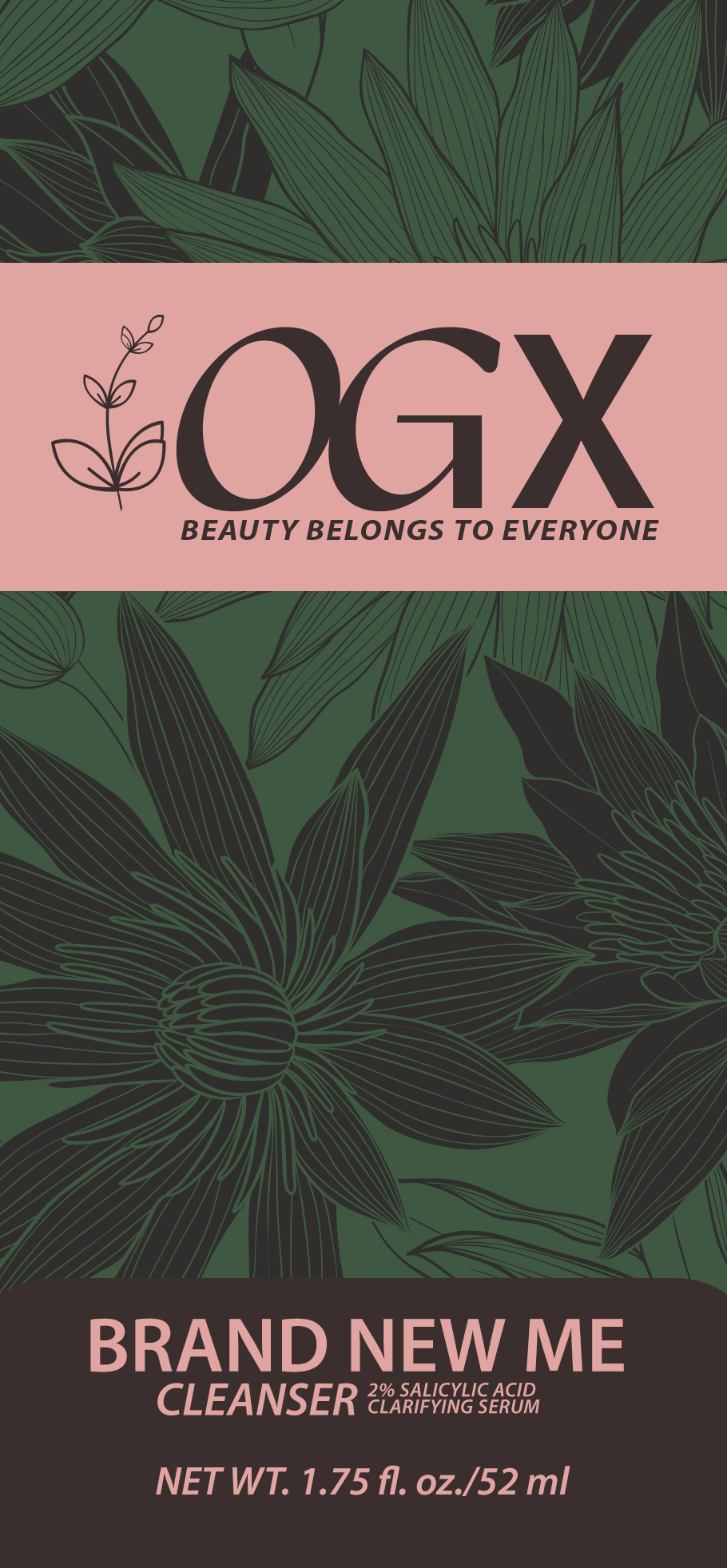
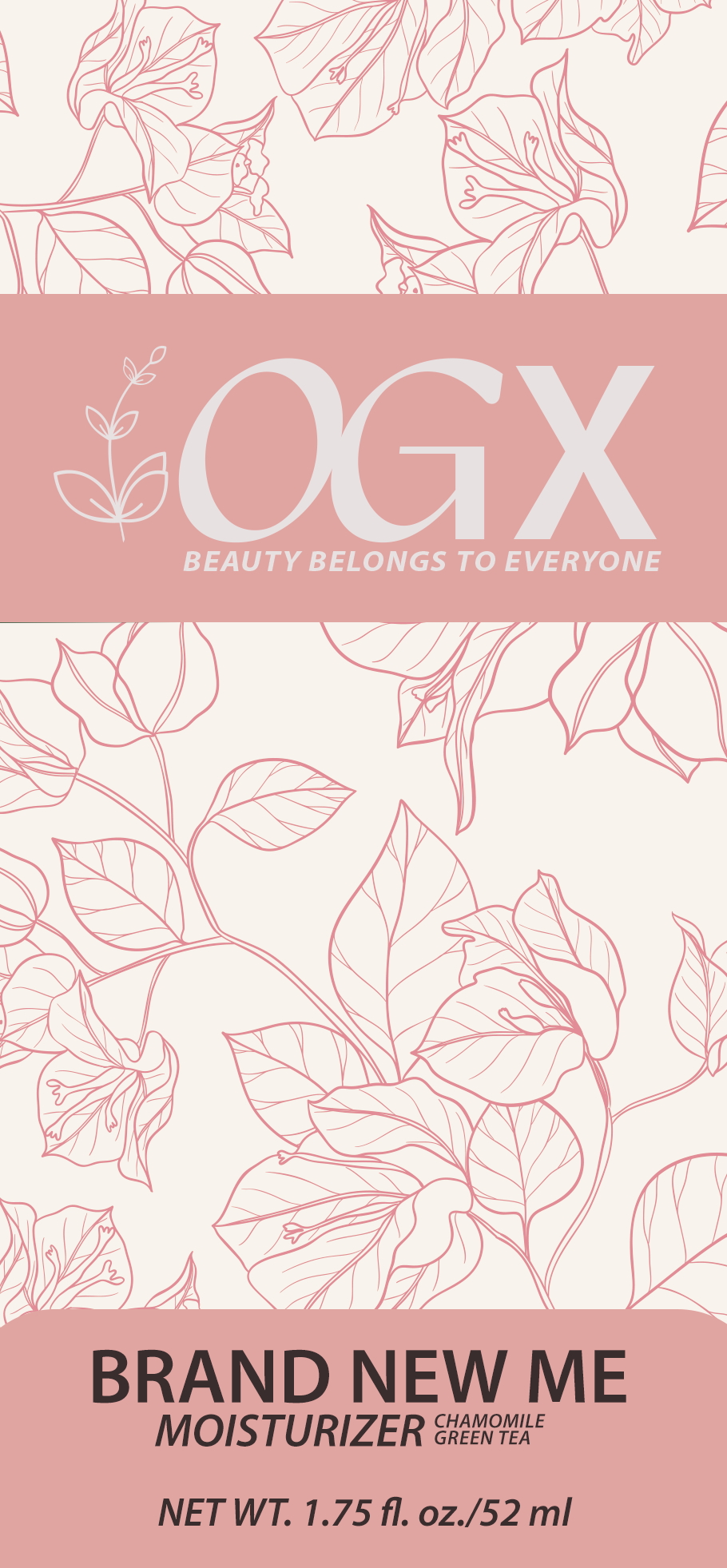
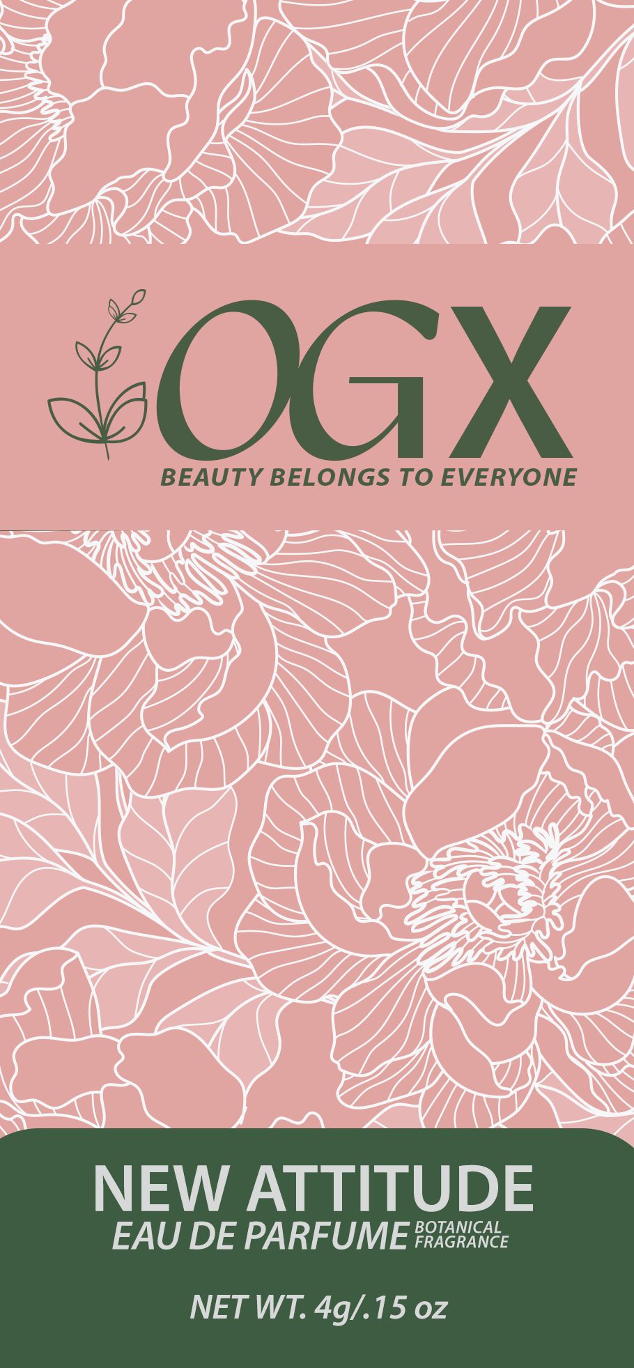
My prompt was to redesign brand packaging for a
line of organic skincare products.
I did this through establishing four designs that all follow a
similar theme and rotate between four main colors.
In this specific project, there is an assumption that
“OGX” has pre-existing brand recognition.
The most prevalent brand designs are in
pink and white, with green and black
being alternatives throughout the packaging.
“OGX” is meant to be a play on words on “organics”.
The brand redesign focuses mostly on pinks and whites
to be more appealing to a feminine audience. It maintains the
feeling of an organic brand through the packaging being either
reusable or easily recyclable.


Girls in Gear (G.I.G)
is a concept company created by two of my classmates and I.
G.I.G. is a car-sharing service ran
by women for women.
The following projects were designed by me.
Anna Lewis and Madison Chiasson served as the copywriters and designed concept contributors.
The pitch deck includes other aspects of this project not designed by me.


Girls in Gear (G.I.G.) chose to advertise in Tampa Bay Magazine. Tampa Bay Magazine focuses on what is happening locally and can serve as a guide to both residents and visitors. G.I.G. is attempting to participate in local advertising by reaching the younger population of Tampa Bay (specifically the Millennial and Generation Z age range) through the usage of the popular viral phrase, “The girls that get it. Get it.” This is a direct attempt to connect with this age range and make viewers relate to our company personality. Through our objective of creating a sense of connectivity and closeness with the Tampa Bay area, we chose a magazine advertisement over a newspaper advertisement. Selecting a magazine advertisement assists us in focusing on our target audience of women who actively travel and participate in local events. Typically, a magazine like the Tampa Bay Magazine could be found in an airport or office area that our audience may look through during their downtime while waiting on an appointment or leaving a flight. Even if an individual is not personally subscribed to the magazine, they would still see it areas like this, and their interest would peak.
our group created a billboard with the intended environment being a highway. The advertisement features text that states “Sorry boys, this one’s for the girls”. This statement was chosen intentionally to clearly announce that our car ride service is specifically for women only. The background image is a car interior to signify that Girls in Gear is a ride-share company. The car’s interior has pink accents to add contrast that complements the dark black leather interior. Our group chose a highway as the intended environment for this advertisement because the placement guarantees that many potential customers will become aware of Girls in Gear. The background for the mockup is a subway/bus station. We want potential consumers to choose our service over the subway/bus, and we use the idea of exclusivity in the ad (through the phrase usage) to help persuade consumers.
We placed our product in “The Bold Type,” a Freeform series that is available for streaming on Hulu. The show is centered on three friends who are employed at a women’s magazine, as they deal with challenges and life as women. Our decision to use “The Bold Type” stems from the show’s focus on personal growth and self-identity. “The Bold Type” strongly aligns with our brand values and reaches our primary demographic of Millennial and Generation Z women. As it is available for streaming, it increases the reach of our product, especially as streaming services tend to be focused on younger audiences. Girls in Gear’s integration as a notification within “The Bold Type” is intended to make the product placement feel more natural within the story. It is an attempt to show that Girls in Gear is a quick, accessible ridesharing service that can be used at any time. The main characters using Girls in Gear would serve as a quick brand introduction that would pique the interest of viewers.


D&ad hosts a “new Blood Awards”.
My group submitted for the Kraft prompt,
Where we advised that Kraft start a new campaign,
“Food For the Soul”.
I served as a copywriter and designer in this project.
Anna Lewis and Madison Chiasson served as the copywriters and designed concept contributors.


